Chappal.
Brand Identity
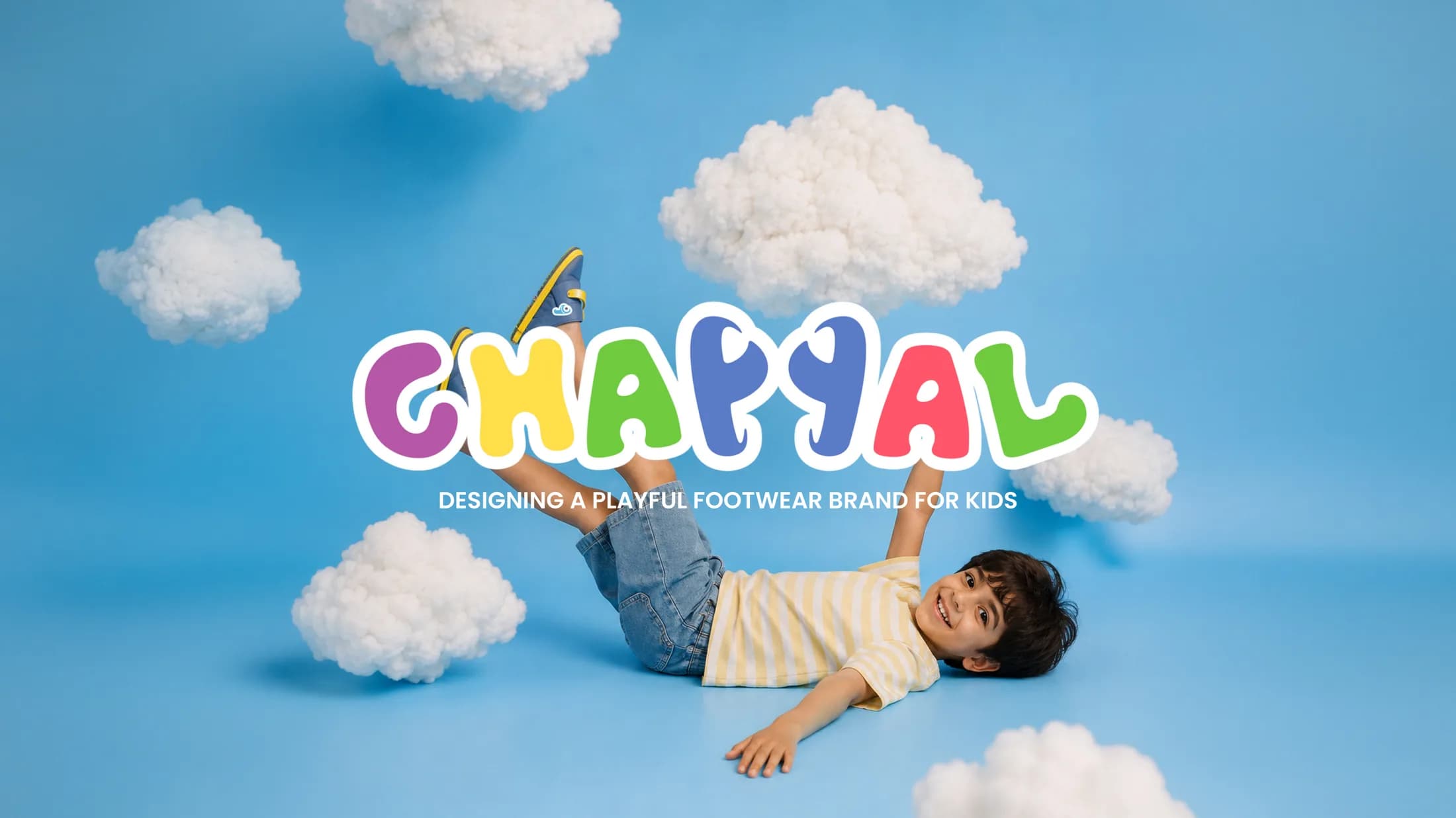
A playful footwear brand for kids
- Role
- Brand strategy, identity design, packaging, campaign
- Industry
- Kids Footwear
- Deliverables
- Brand StrategyVisual IdentityMascot DesignPackagingCampaignSocial Media
Overview
Chappal is a premium children's footwear brand built to celebrate the joy of childhood. The identity had to charm two audiences at once — kids, who choose with their eyes, and parents, who choose with their heads — and stay flexible across packaging, campaigns and digital.
The idea
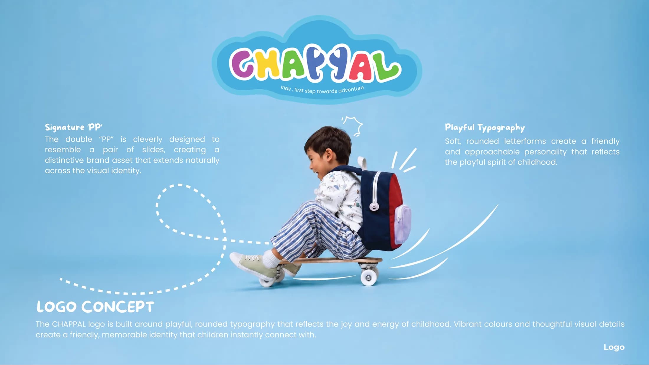
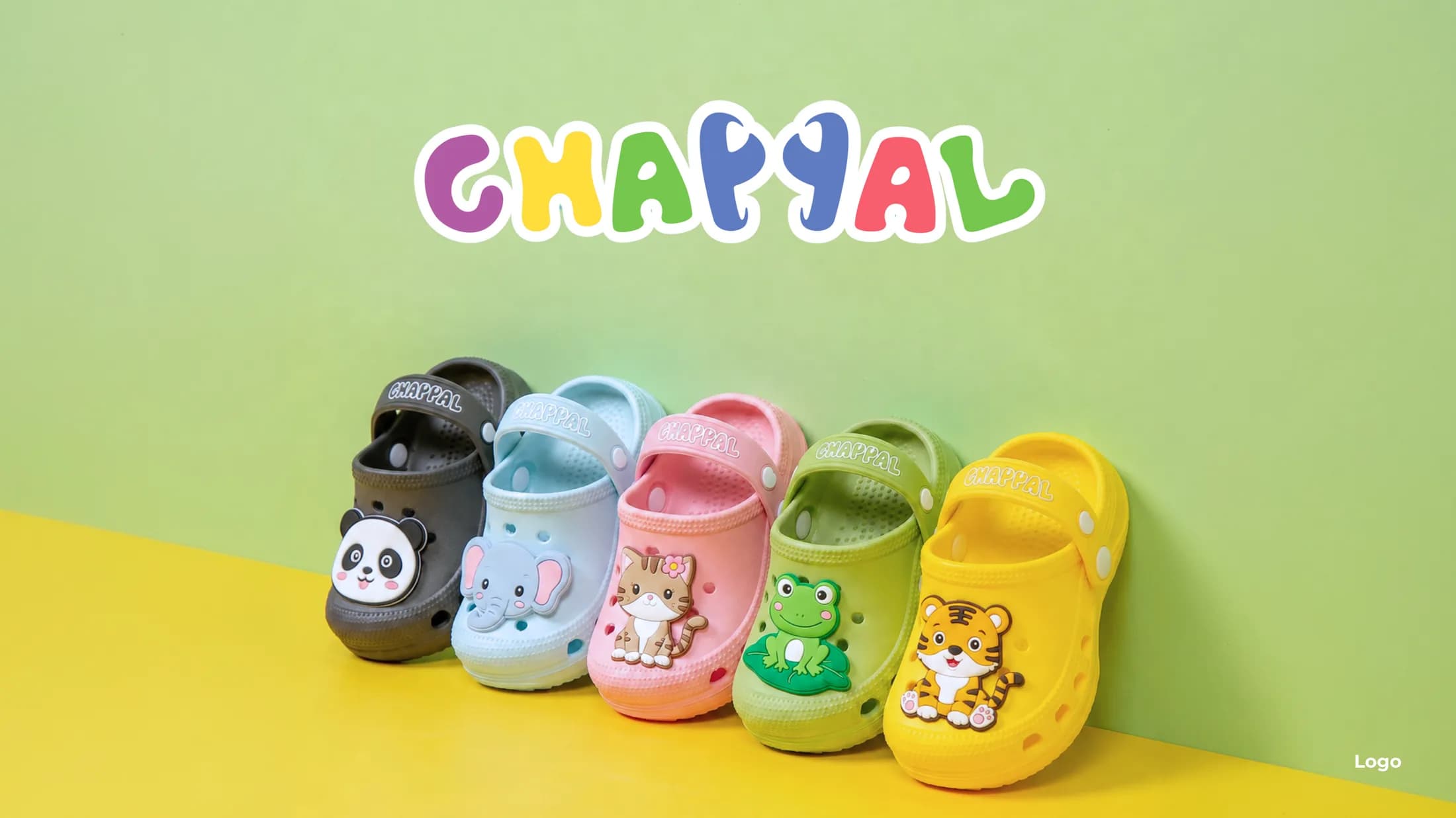
The double “PP” at the heart of the wordmark is drawn as a pair of slides. One detail carries the whole identity — it turns the name into the product, and every touchpoint gets to play with it.
01 — Identity
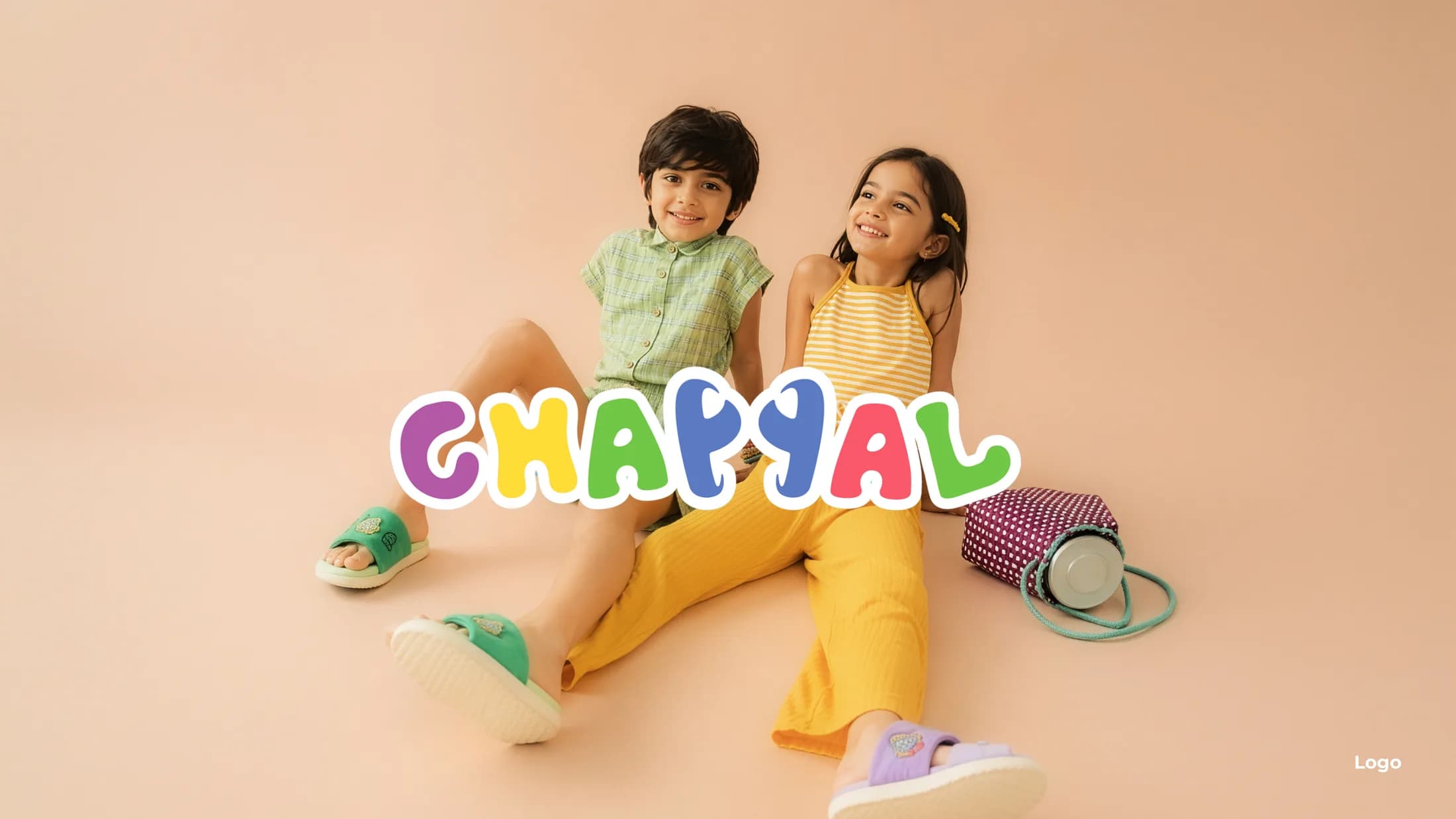
A wordmark that is the product
Soft, rounded letterforms give the logo the energy of a toy rather than a label. Vibrant color and expressive typography keep it legible at shelf distance and lovable up close.
02 — Mascot
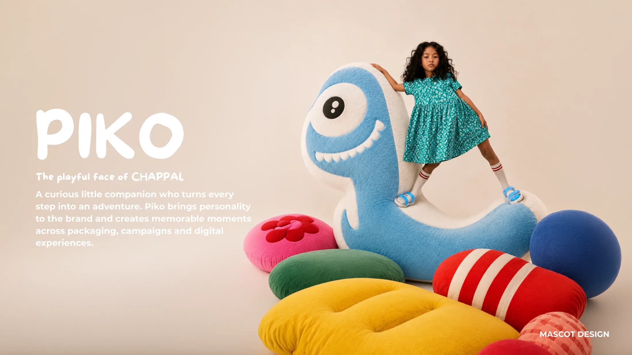
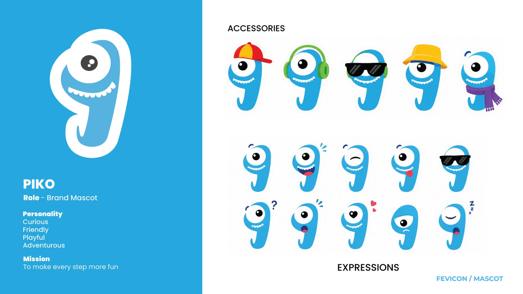
Piko, the face of the brand
A curious little companion who turns every step into an adventure. Piko gives the brand a voice for packaging, campaigns and social — and a full expression system keeps him consistent everywhere.
03 — Packaging
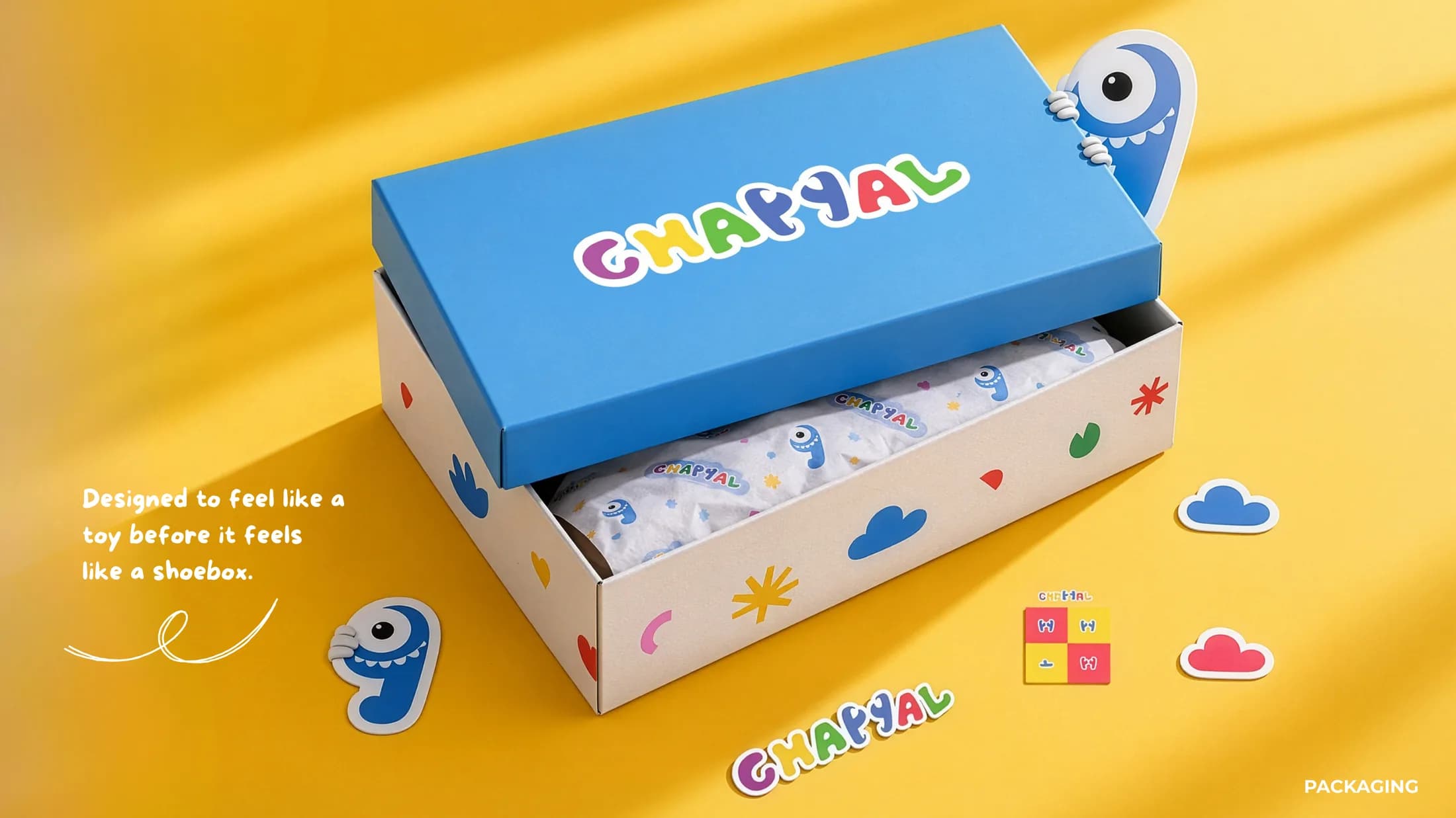
A toy before it is a shoebox
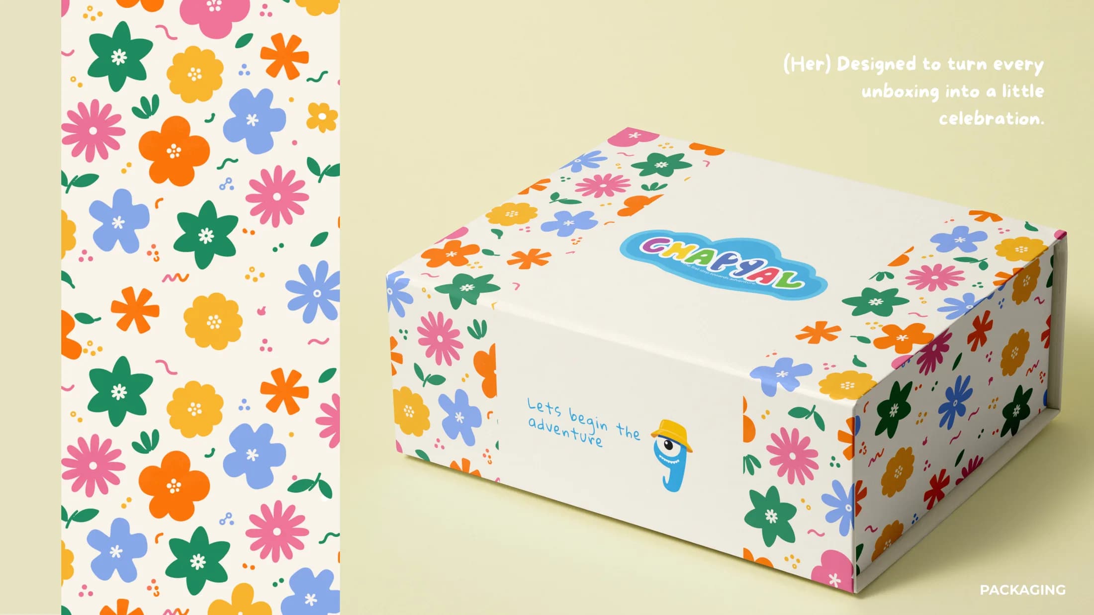
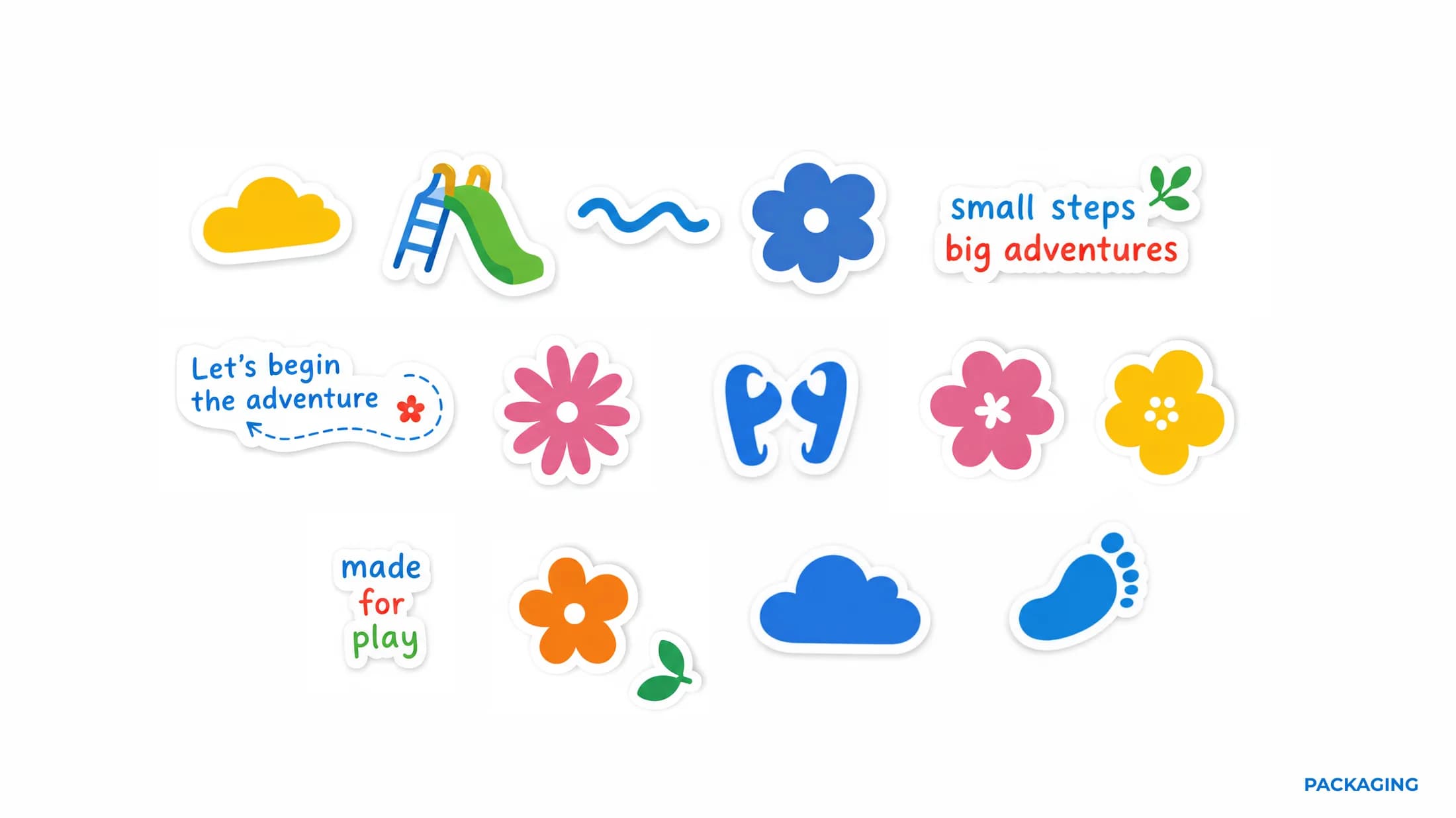
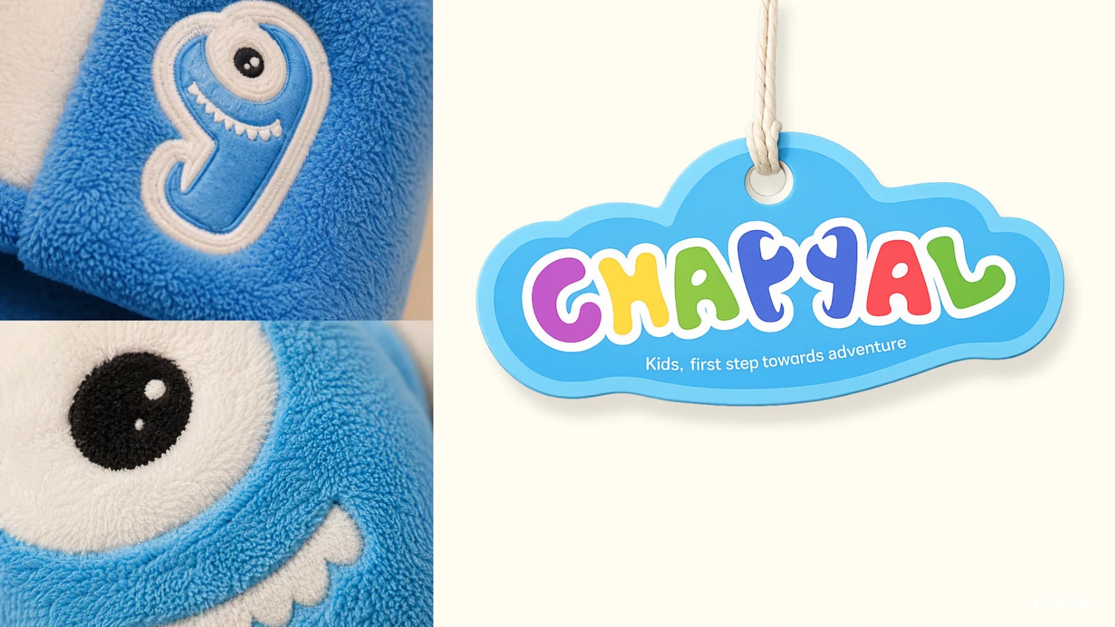
The unboxing is designed as a little celebration: pattern-wrapped boxes, sticker sheets and hang tags that kids keep long after the shoes are on their feet.
04 — Campaign
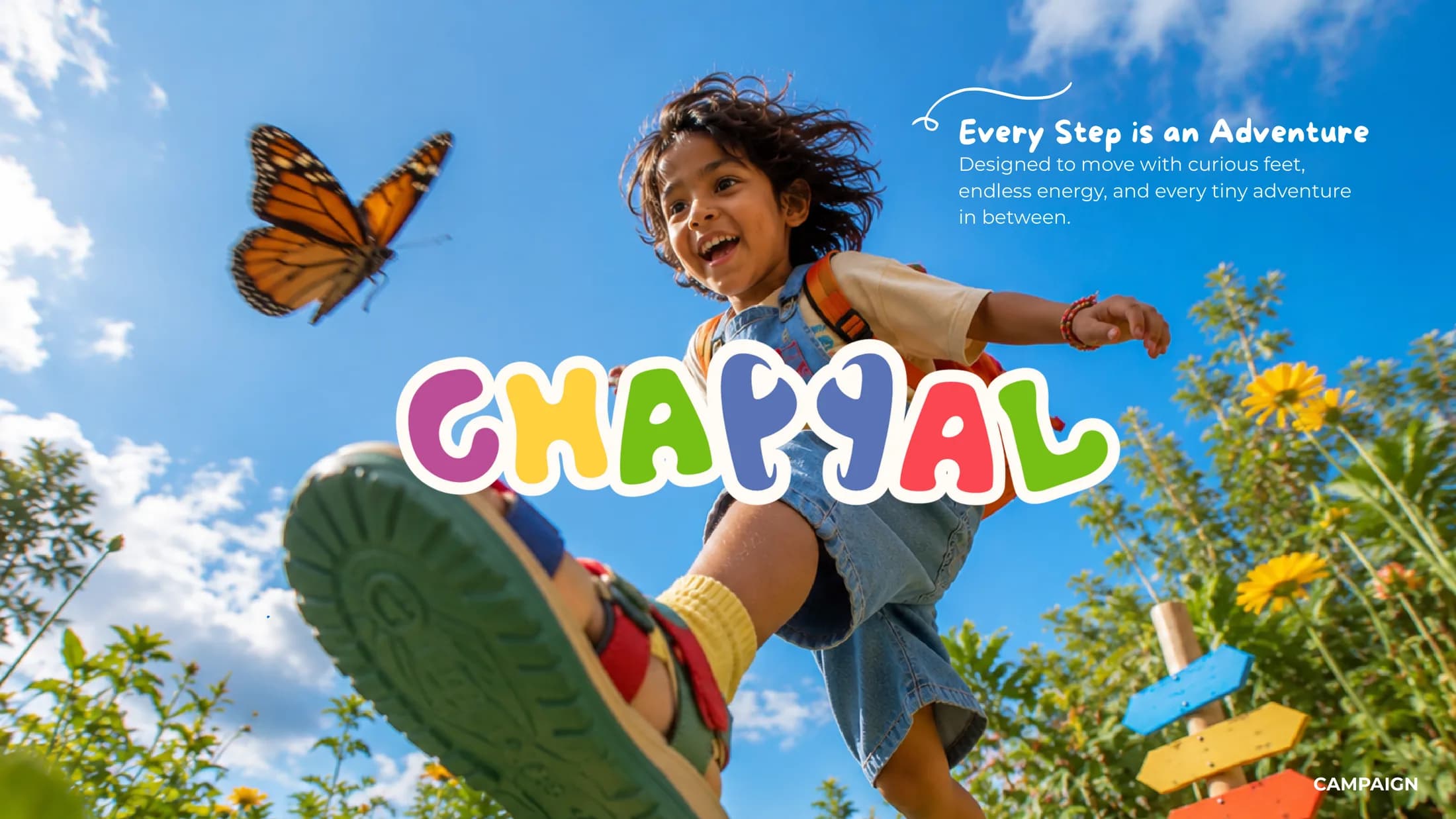
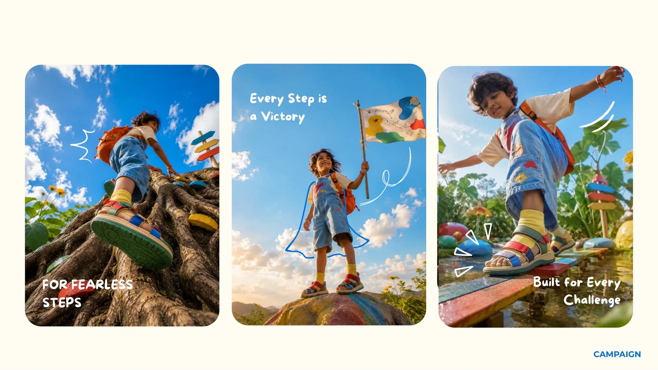
Every step is an adventure
Designed to move with curious feet and endless energy — the campaign frames everyday play as small victories.