Rajasthan Tourism.
Rebranding · Strategy
Rebranding a state through its women
- Role
- Research, brand strategy, logo design, web concept
- Industry
- Tourism
- Deliverables
- Brand ResearchStrategyLogo DesignColor SystemWebsite Concept
Overview
Rajasthan's tourism identity has always spoken through forts, camels and turbans — object symbolism, and almost entirely male. The research found the gap: the people who actually carry the state's living culture, its women, were missing from its brand.
The idea
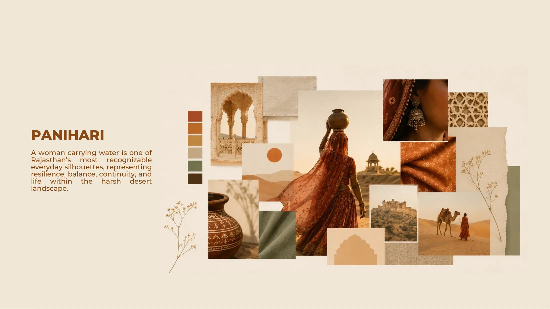
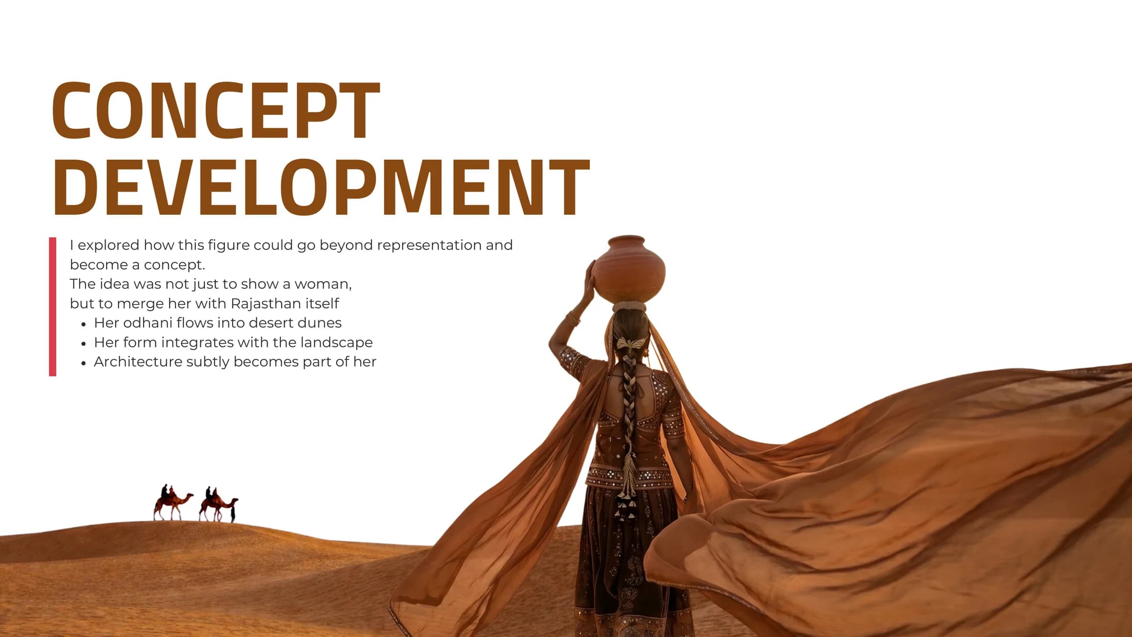
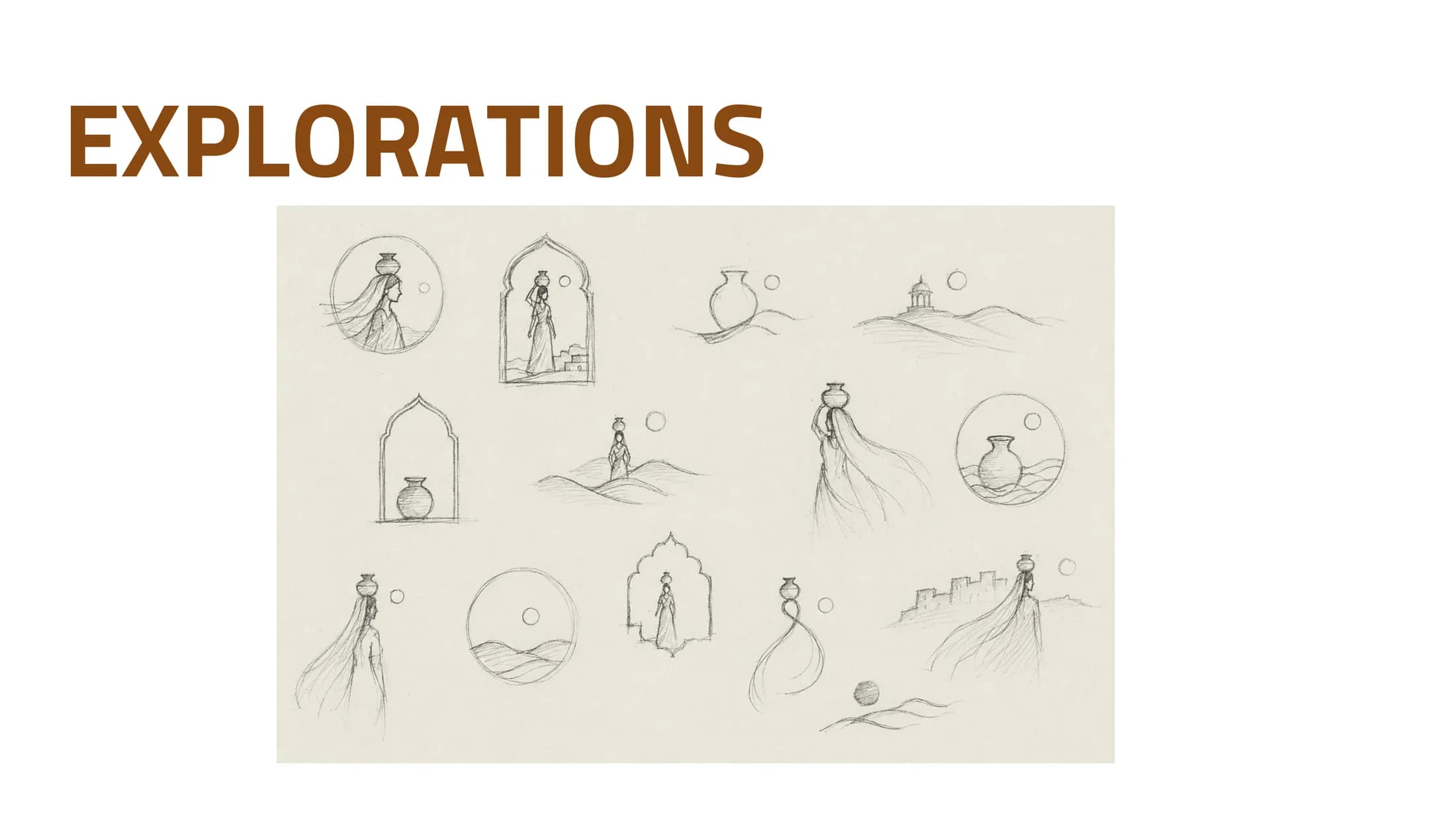
The Panihari — a woman carrying water — becomes the identity. Her odhani flows into the dunes, the matka holds life in the desert, arches and horizon settle into her silhouette. She is not placed in Rajasthan; she becomes Rajasthan.
01 — Concept
From symbol to subject
The concept merges the figure with the landscape itself — veil into dunes, architecture into form — shifting tourism branding from monuments to the lived identity of the state.
02 — Identity
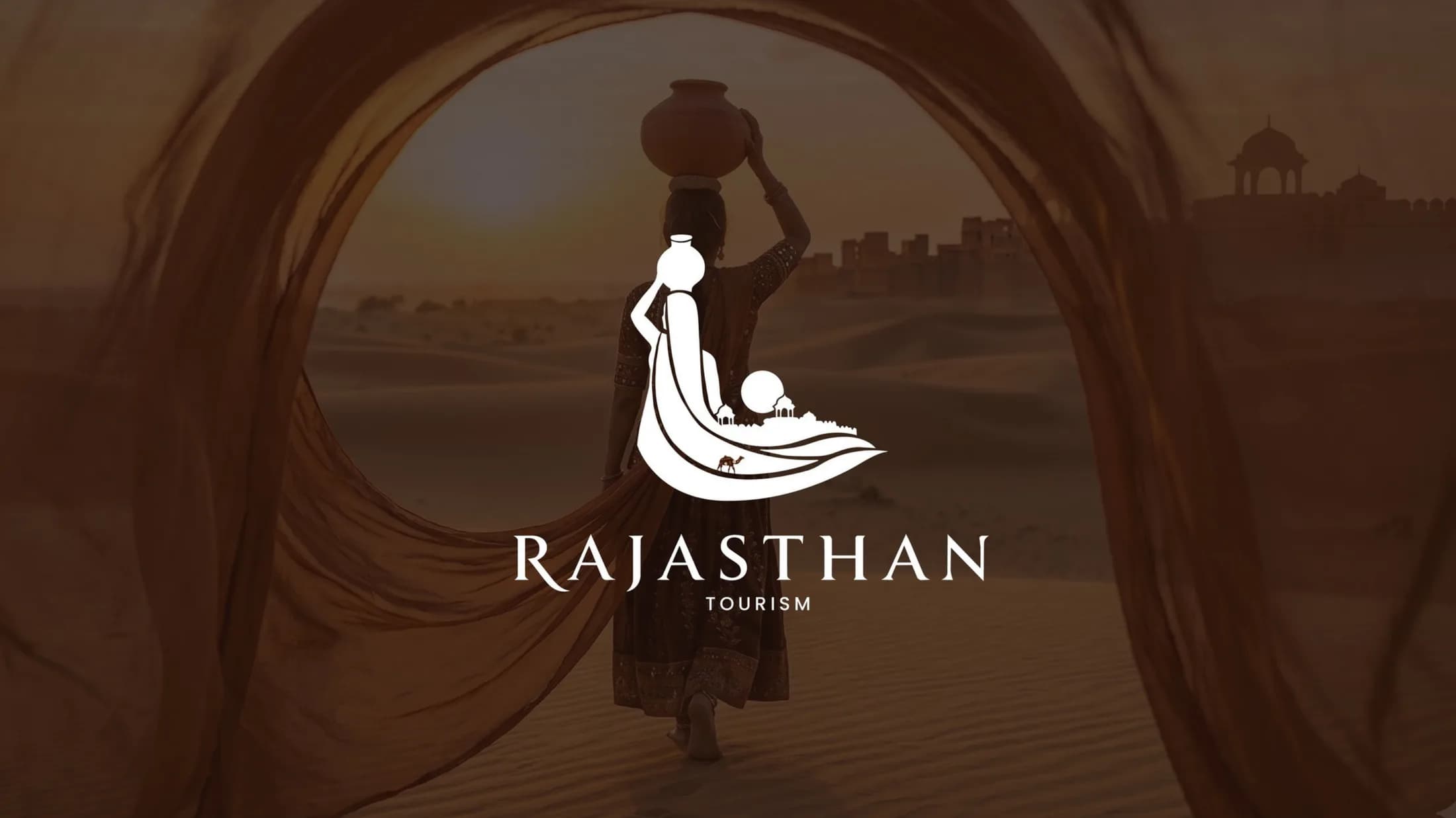
The final mark
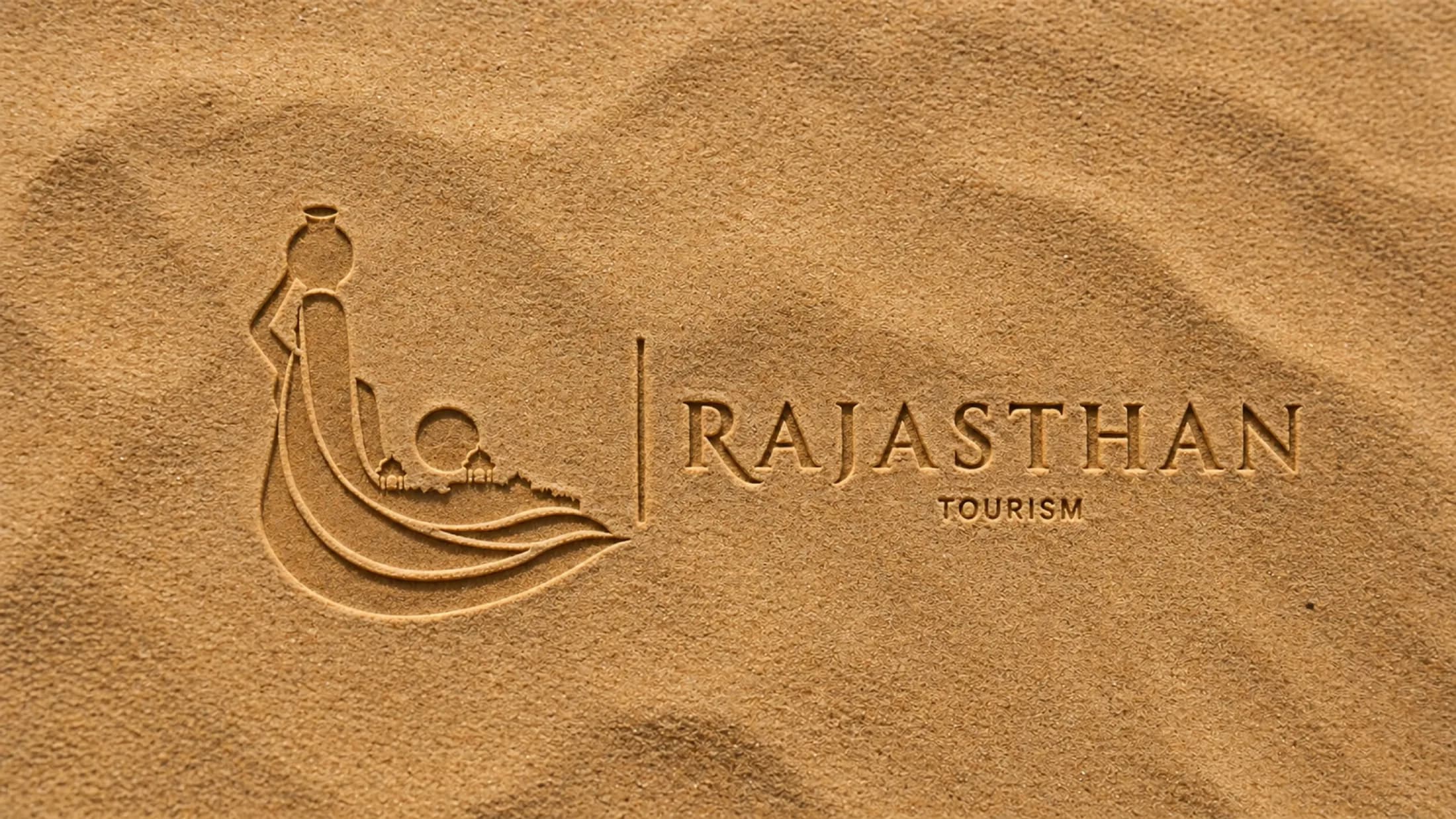
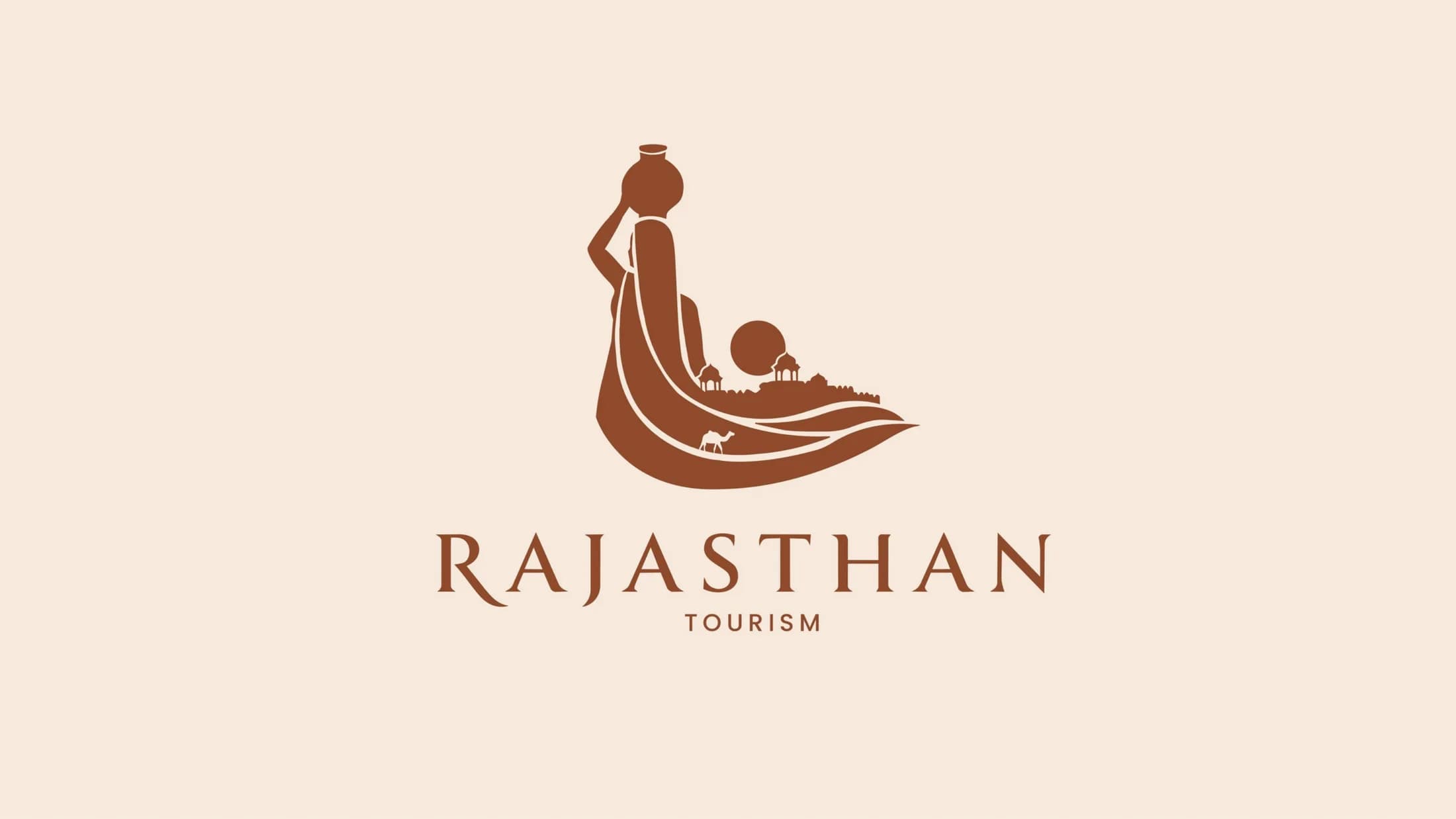
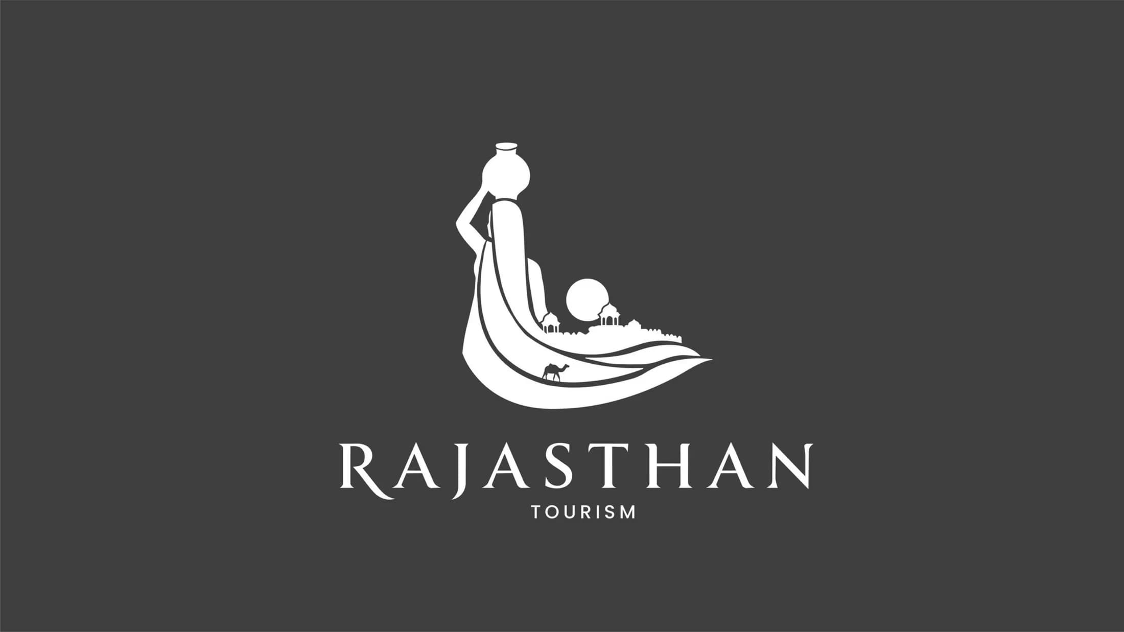
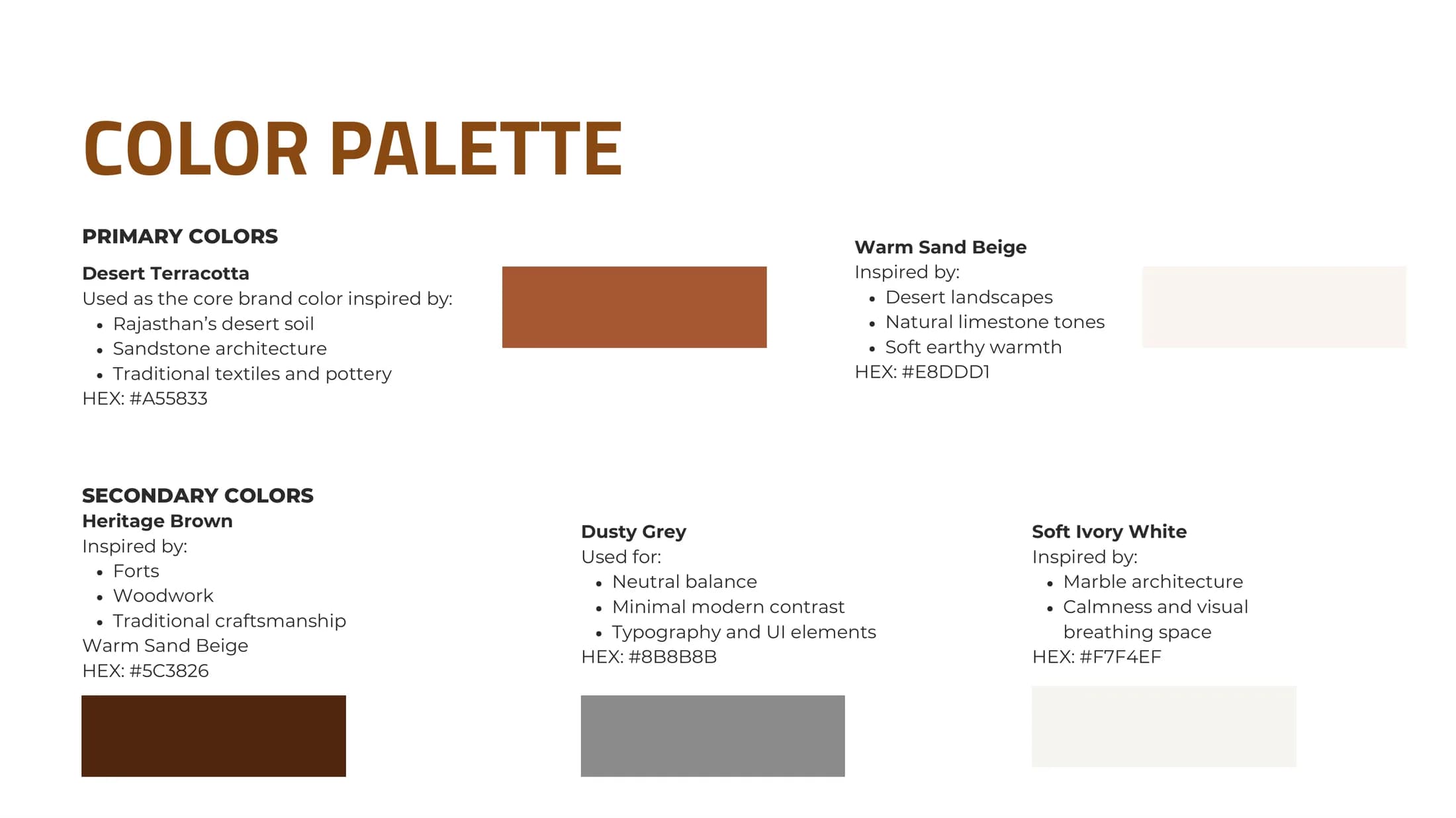
A silhouette that reads at a glance and rewards a second look — camel, chhatris and dunes are folded inside the flowing veil. The palette is drawn from the state itself: desert terracotta, heritage brown, warm sand.
03 — Application
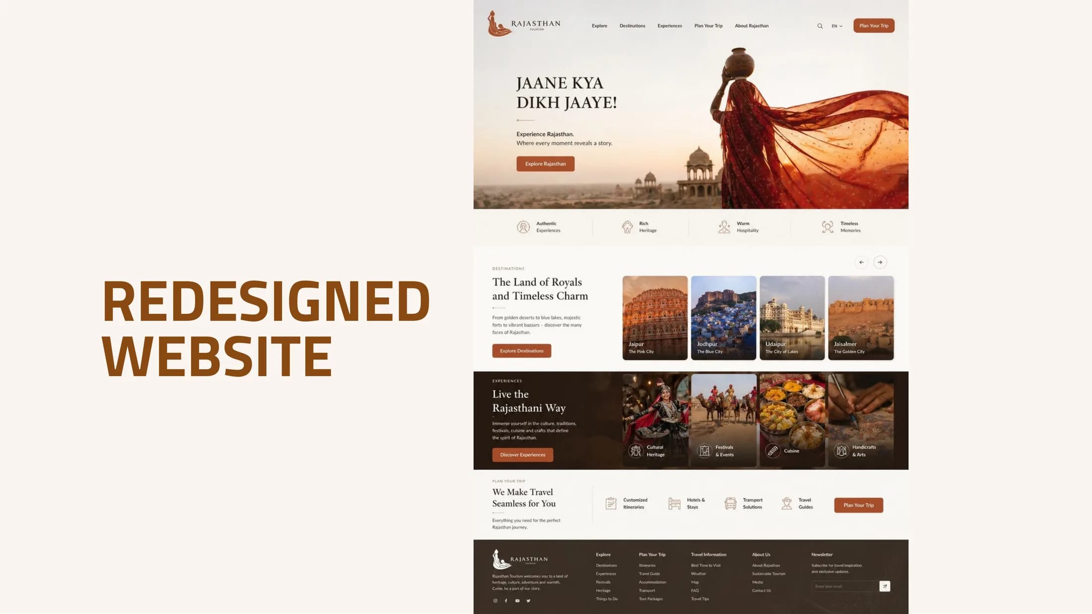
Carried onto the web
A redesigned tourism website concept puts the identity to work — warm, editorial, and human-first, against the current portal.